Pennsylvania College of Technology, Senior Project, Spring 2026
PROPOSAL
As a woman motorcycle rider, I realize how hard, stressful, and intense it is to become a female motorcycle rider. Between finding the right fit bike for you, finding other women to get advice from, and just learning safety and other
skills that come along with riding, it takes a long time to feel comfortable in this
male-dominated sport. If there was a campaign to act as a resource for women to branch out and make the process of becoming a biker easier, this could no longer be a sport controlled by mostly men. As a potential solution, I created
and designed a motorcycle campaign to give women the encouragement and confidence they need.
HER MOTO is a campaign that gives women riders the attention and advice they deserve. No matter whether they’re a beginner or an experienced woman who just wants to take part, HER MOTO has a place for everyone. They have subscription boxes built for women, advice for riders on all levels, and so much more. Women will also have the resources to connect with other female riders, helping them to realize that they’re not alone and can grow together. By creating this community, women riders are able to access everything they need to start this hobby, but also feel included and confident while doing it.
The primary target audience will be U.S. females looking to begin riding motorcycles aged 18-35. According to a study conducted by the Motorcycle Industry Council, the younger the rider demographic, the more women you’ll
find in it. 26% of women riders are Millennial and 22% of them are Gen Xers. Overall, women ridership is growing significantly, making up nearly 20% of U.S. motorcycle owners. Although my target audience are U.S. females looking to begin riding motorcycles aged 18-35, it’s important to understand that this brand is diverse and has designs for women of all skill levels and ages.
CITATION
“About Us.” Women Riders Now, Women Riders Now About Us page. Accessed Jan. 2026.
WHAT IS HER MOTO?
HER MOTO is a motorcycle brand and community built for women riders. In a space traditionally dominated by men, HER MOTO exists to remove barriers and make the world of motorsports more accessible, welcoming, and empowering for women.
Our mission is to create a space where women can connect, learn, and ride with confidence. From gear designed to fit HER body—not resized versions of men’s equipment—to a supportive network of riders sharing knowledge and experience, HER MOTO is redefining what it means to belong in motorsports.
This is more than a brand—it’s a movement. Women are no longer standing on the sidelines or riding as passengers. They are taking control, building community, and claiming their place on the road.
TARGET AUDIENCE
HER MOTO is designed for women ages 18–35 who are interested in motorcycles and motorsports, ranging from beginners exploring riding for the first time to experienced riders already immersed in the culture. This audience is in a stage of life where identity, independence, and community are important. According to a study conducted by the Motorcycle Industry Council, the younger the rider demographic, the more women you’ll find in it. 26% of women riders are Millennial and 22% of them are Gen Xers.
Research shows that women are one of the fastest growing segments in motorcycling. Additionally, platforms like Instagram and TikTok have amplified visibility of female riders, creating a digital culture. This increase representation has began to help normalize women in what was historically seen as a male-dominated space, encouraging women to participate.
HER MOTO targets this audience not only because of its rapid growth, but because these riders are actively seeking community, representation, and belonging. Women in this age range are highly engaged with brands that align with their values and identity, especially those that foster inclusivity. By creating a brand centered on connection, visibility, and shared experience, HER MOTO positions itself to support a new generation of riders who are redefining motorcycling culture and building a strong, supportive community around it.
RESEARCH SYNOPSIS
The primary research I did before the start of this project was figuring out who I wanted my target audience to be, as well as what features would play an important role in making this a successful brand. To do this, I conducted research through many different resources such as the Motorcycle Industry Council, Women Riders Now, and other resources through social medias like Instagram and TikTok. The factors that I found would be most important included the brands colors, visuals, and features offered. After figuring this out, I was able to move on and create a list of my objectives and deliverables.
Once I had my goals set, I began further research into design trends within the motorcycle industry. I also took a closer look at female influencers within this industry. This helped me choose the overall aesthetic I wanted to achieve. I found that having different clothing and gear options available, as well as a subscription box available on the website would be an attractive feature towards my targeted audience. After conducting my research and figuring out the basics, the rest of the design principles fell into place.
PROCESS NARRATIVE
For my process, I wanted to focus on assuring that all components of my project were cohesive. The piece that took the longest was figuring out my logo. Once I figured out my brand colors, typeface, and other important components to start with, the rest fell into place along the way. After I completed the logo, I moved onto my brand guidelines. Typically, guidelines tend to be completed at the end of a project, but updating mine along the way kept my final goal in sight. Once that was completed, I created my subscription box, letter, and items that would be included inside. Having these parts figured out led me to begin working on my website. I knew what all needed to be included on it, which made the process much easier.
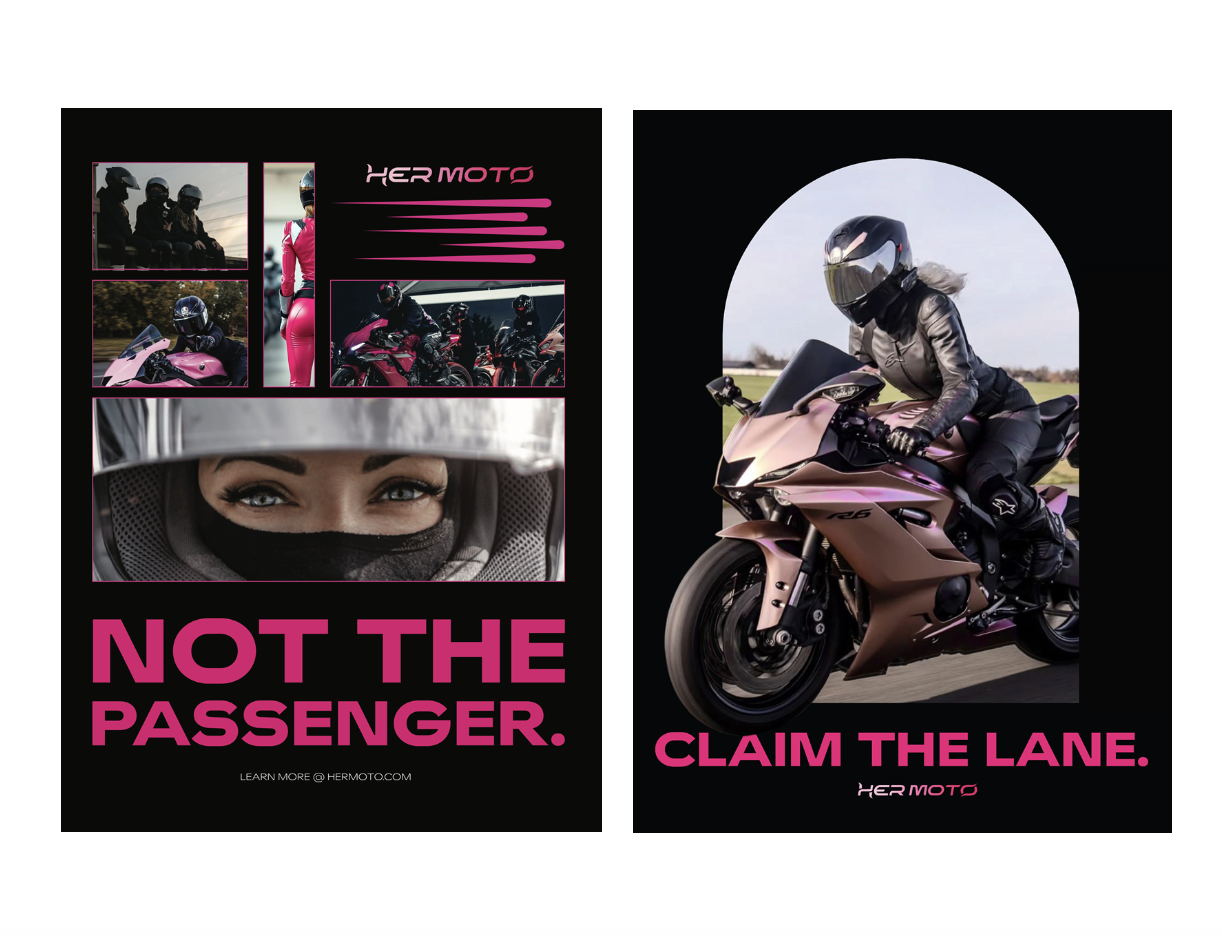
After having the logo, guidelines, and website done, I then began working on the promotional posters. Using the taglines I decided on in my brand guidelines, I made two different posters inspired by them, that would be eye catching to my audience. I created my stickers next. I made two with the logos and two with the taglines. These were cohesive with the overall brand, but also my posters. I finished up with updating my brand guidelines for the final time. Overall, my components came together nicely, achieving being cohesive with one another.
PROCESS WORK: LOGO
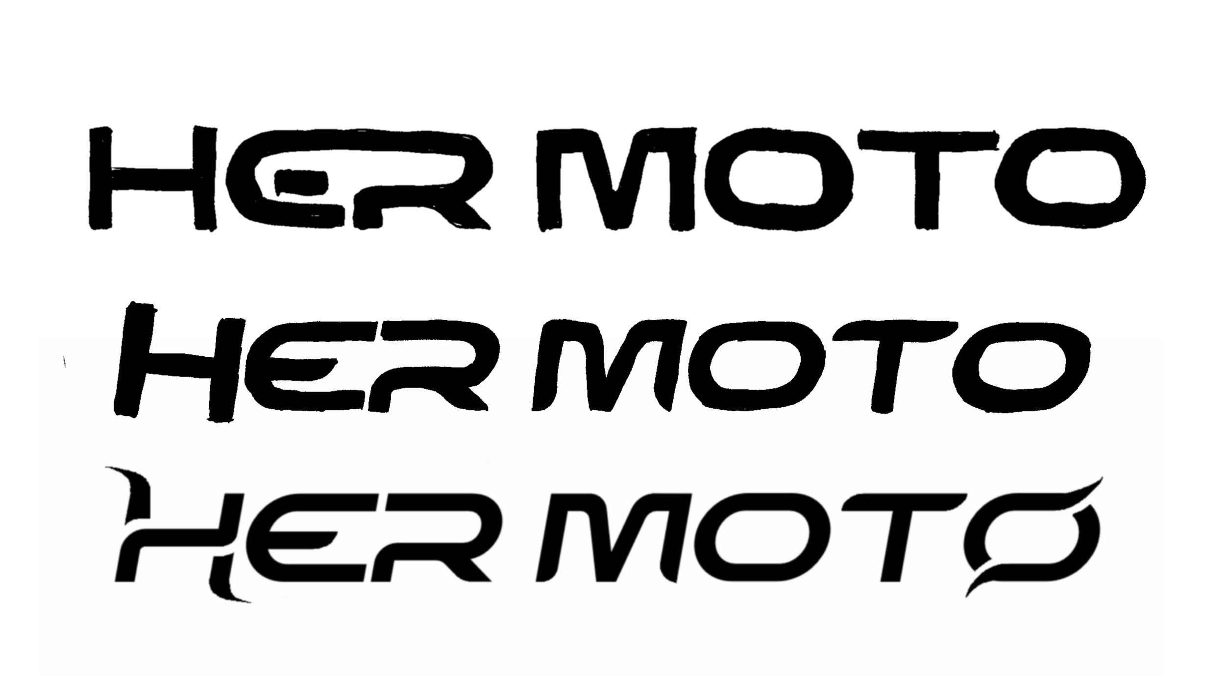
For my logo process, I began creating my primary logo first. I wanted it to be horizontal, as it is easy to read and is easy to make versatile across gear, socials, and accessories. I used the typeface Widescreen as my starting point, and altered it until I achieved the final look. For the secondary logo, I created a stacked version, making the word HER larger than the word MOTO intentionally. Overall, this is logo has the perfect balance of femininity and aggression. It is not overly soft, which is the typical stereotype for a female, and it is not too aggressive, helping to stay away from the masculine side of things.
Why a word mark?
Keeping a logo as a word mark keeps the focus on name recognition. After all, the main goal throughout the brand is to recognize women. The brand does not need extra symbols in the logo to prove itself.
Why pink?
The color pink reflects femininity and is viewed as an inviting and approachable color. Magenta is also seen throughout the branding. Using these bright hues on merch or other gear allows the rider to be seen, promoting a sense of safety as well.
Why Widescreen?
The chosen typeface reinforces the brands identity. Being italicized allows the logo to give off a sense of speed and motion, just as a motorcycle does. Furthermore, it helps to achieve the modern, high-performance aesthetic that was trying to be reached. These characteristics are often seen in our competitors logos and branding.
Why the custom “H” and “O”?
The stylized “H” and “O” have a dynamic, wing-like curve. This feature gives off a feeling of freedom, breaking boundaries, and moving forward. With these characteristics being so distinct, it aligns with the uniqueness of female riders being able to carve their own path for themselves.
BEGINNING
PROCESS WORK: BRAND GUIDELINES
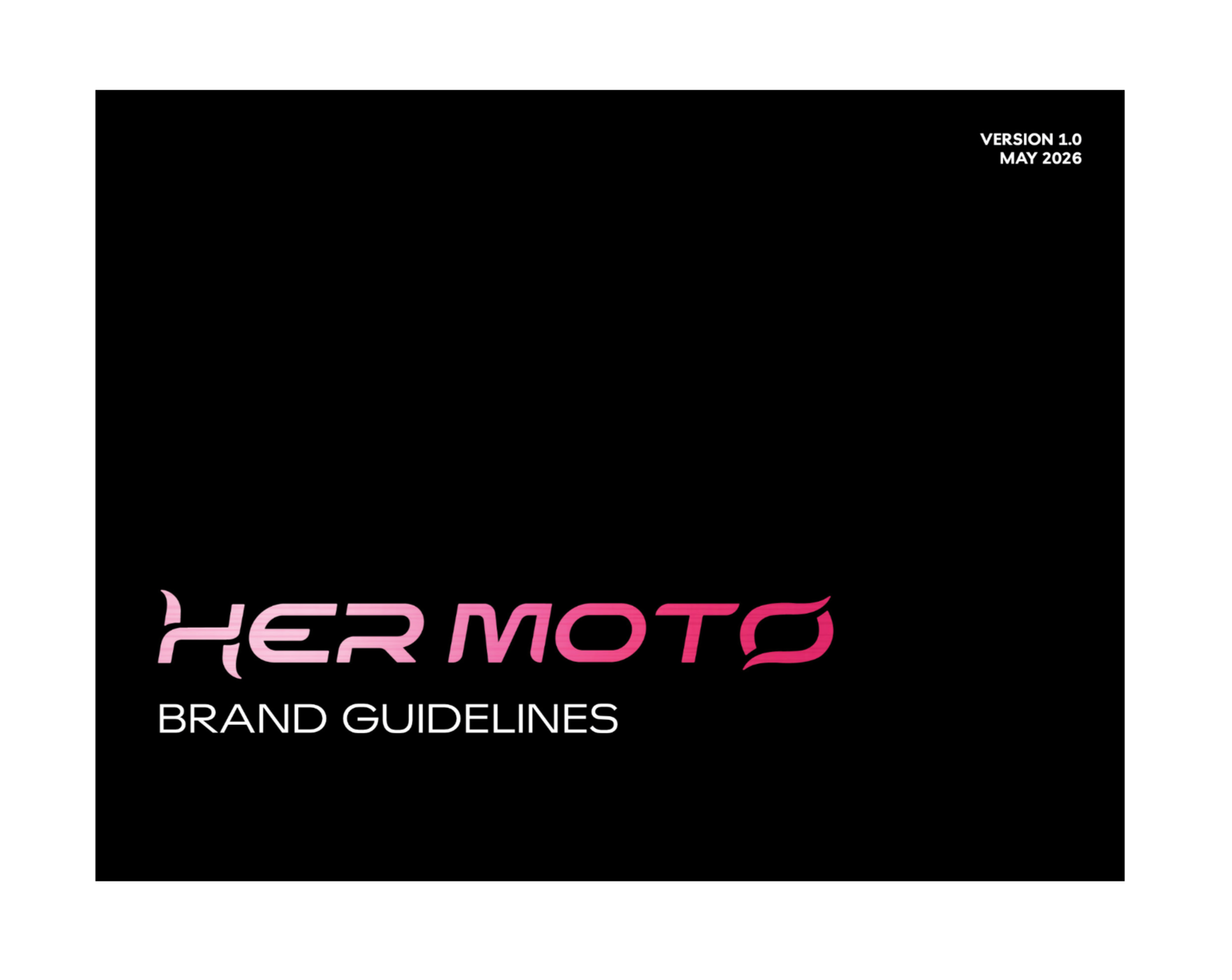
For my guidelines, I worked on them all throughout my project. I created my layout, and updated them as I made progress. This helped me keep track of everything within my brand including the logo, the typeface, rules, colors, and visual expression. Overall, I wanted to keep it clean and easy to understand for the viewers.
Why the large section numbers (01, 02, 03, 04, 05)?
Having the large section numbers not only makes it easy to distinguish which section of the guidelines you’re on, but the extended 0 begins to look like a race track, relating back to the brands roots, giving off a sense of speed, fierceness, and motion.
DELIVERABLES
1 primary logo design
Brand guidelines
Subscription box (with letter and gifts included)
Mockup website pages
2 promotional posters
3 stickers
OBJECTIVES
To independently research, design, and produce a logo, website, monthly subscription box, promotional posters, letter, and stickers for the campaign HER MOTO
To conduct in-depth research into women’s presence within the motorcycle riding community to obtain the strategic and visual direction of the campaign
To synthesize prior knowledge of the fundamentals of design into all necessary components
To create intentional campaign messaging and visual content that promotes empowerment and connection among women motorcycle riders
To design purpose-driven content that supports the campaign by clearly communicating its mission, highlighting the subscription experience, and encouraging participation
To effectively interpret and incorporate constructive feedback from peers and instructors in order to strengthen my concept and overall execution
To establish and maintain a consistent and recognizable visual identity for HER MOTO
To deliver a unified design that demonstrates strong conceptual cohesion, craftsmanship, and attention to detail across all deliverables
END

PROCESS WORK: SUBSCRIPTION BOX, LETTER, & ITEMS
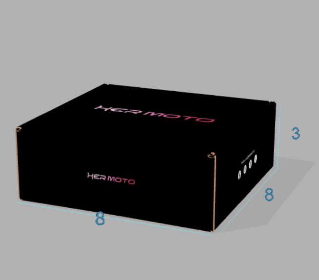
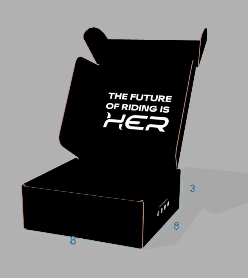
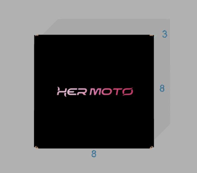
For my subscription box, I used the website Packola. All design work was done through there. The website allowed me to work on a 3D mockup of the box, allowing me to size and place everything correctly. Following how straight forward and direct the brand is, I made sure to keep it sleek and simple, having the logo on the top and front of the box, website on the back, and social media on the two sides. On the inside of the box, the viewer will read “The future of riding is HER.” This interaction is meant to grab the buyers attention and push our mission of bringing the attention to HER.
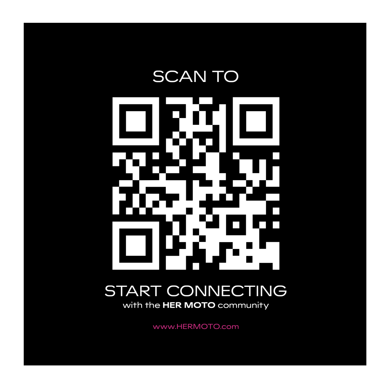
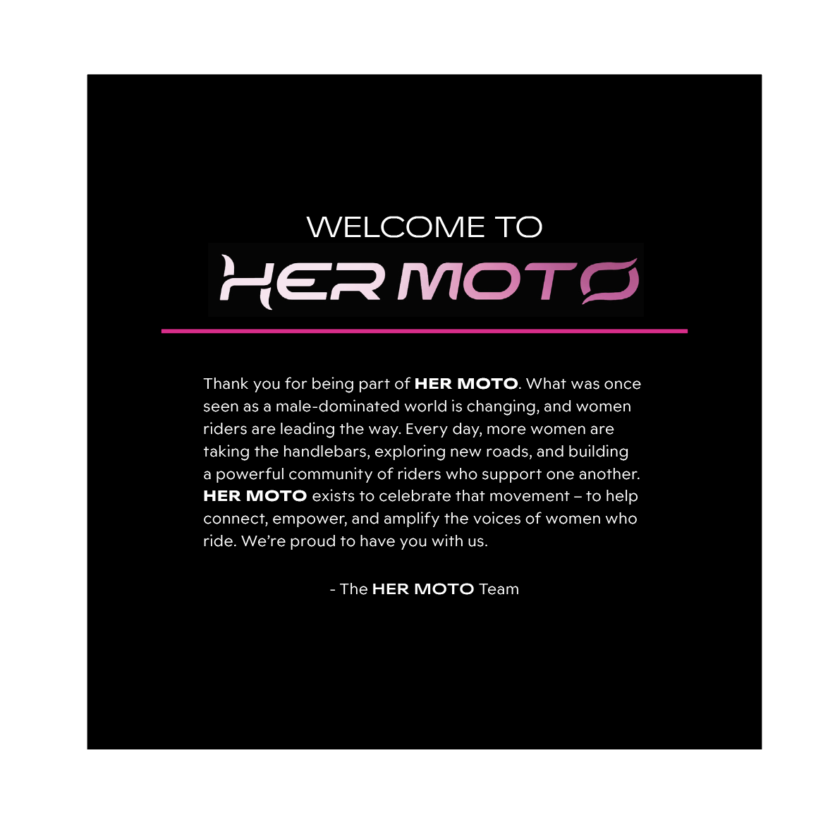
For the letter that is included inside of the box, I began with choosing a size and format. Since the box was a perfect square, I decided to make the letter 5×5 inches. On the front of the card, there is a large QR code. Although this is not the usual size of a barcode, having it this large grabs the attention of the buyer immediately, it encourages action right away, and is easier to use. When the buyer opens the box, this will be sitting right on top, allowing them to scan it before moving further into the package. On the back of the card includes a thank you message from the HER MOTO team. This gives the buyer a sense of belonging.
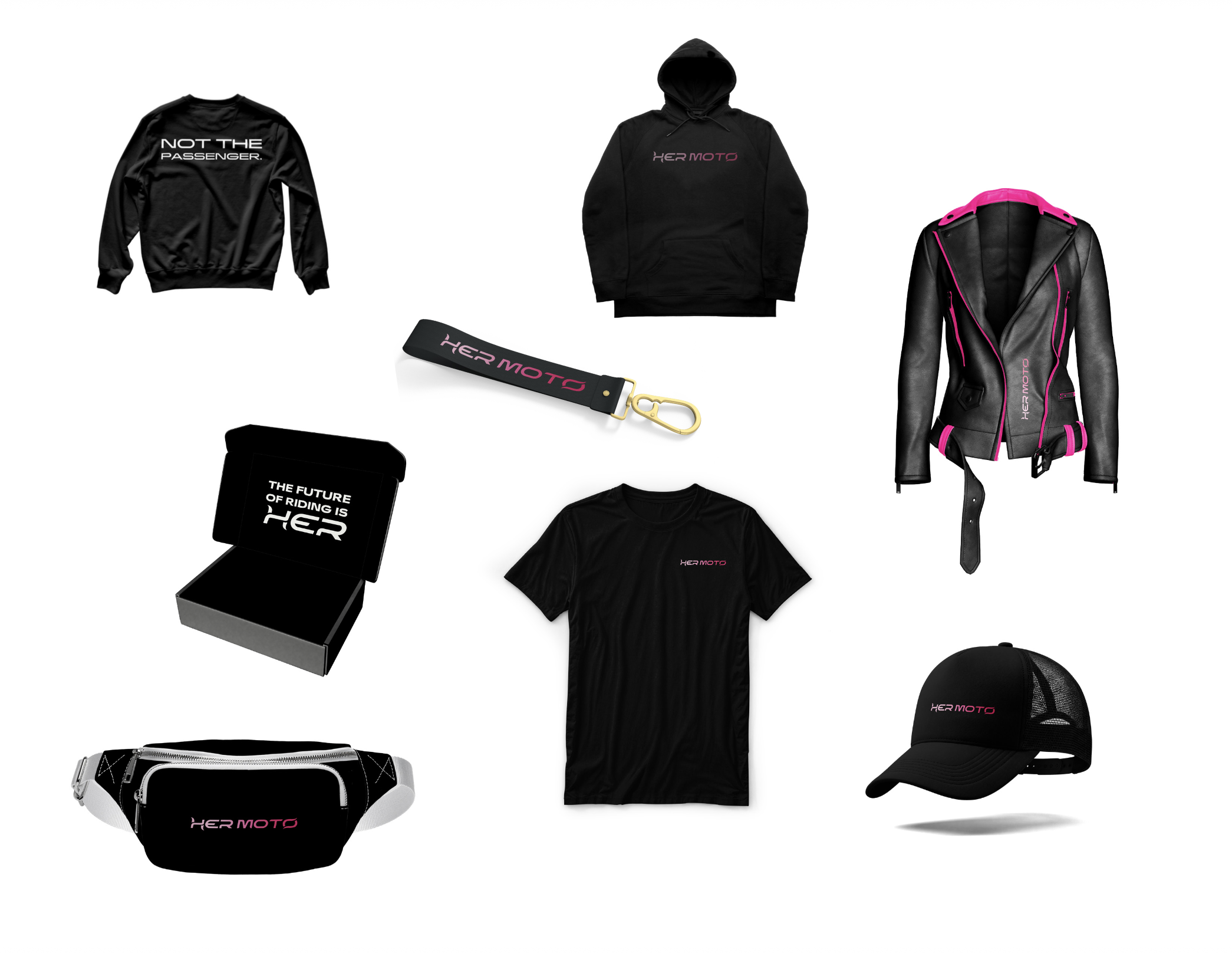
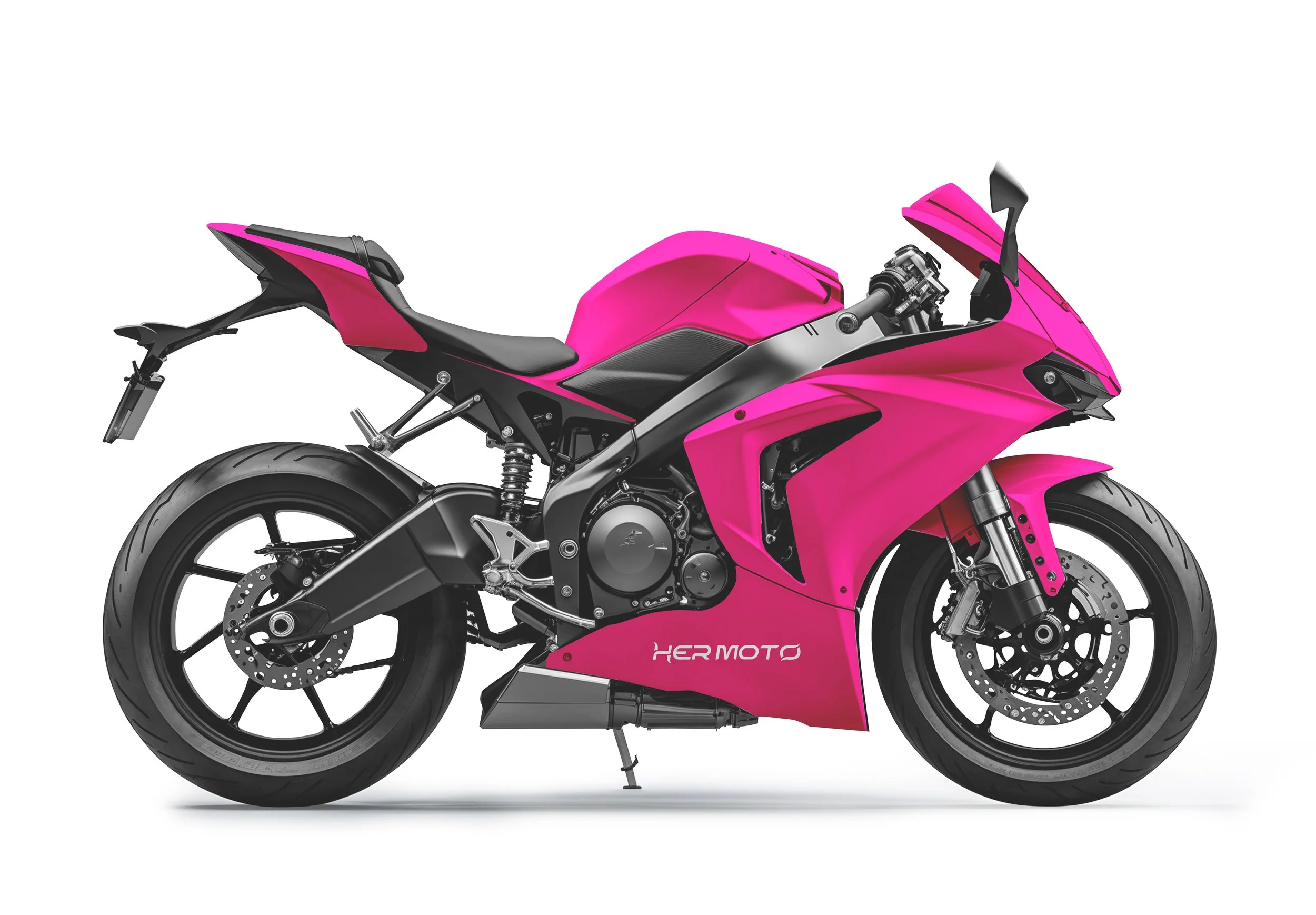
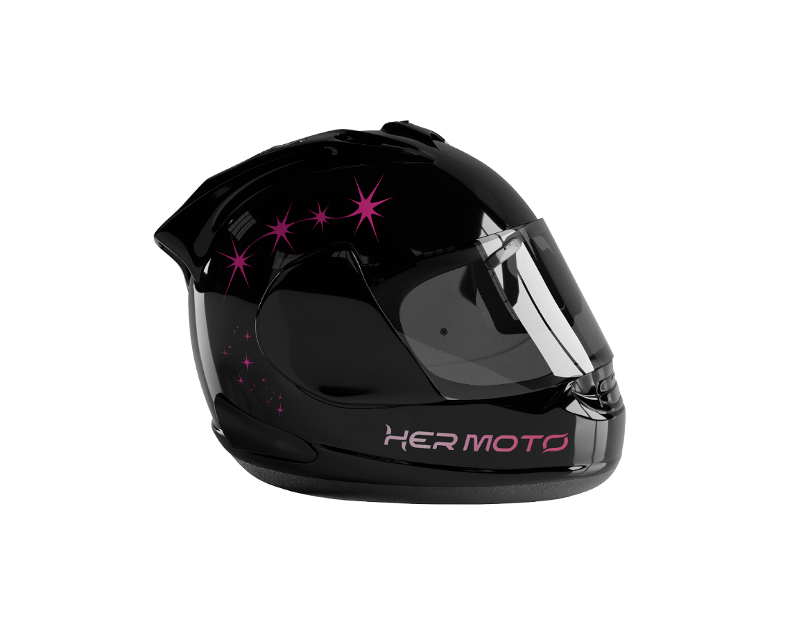
I created and physically bought a t-shirt, fanny pack, and stickers to include inside of the subscription box. For the t-shirt, the front was simply the logo on the chest, while the back read “not the passenger.” The placement was intentional. If a female decides to wear this while riding, it is making a statement to everyone around her. I created mockups of other potential items that could be sold on the websit. These items included a crewneck, hoodie, keychain, hat, leather jacket, helmet, and fairings of a street bike.

SUBSCRIPTION BOX
LETTER
ITEMS
PROCESS WORK: WEBSITE
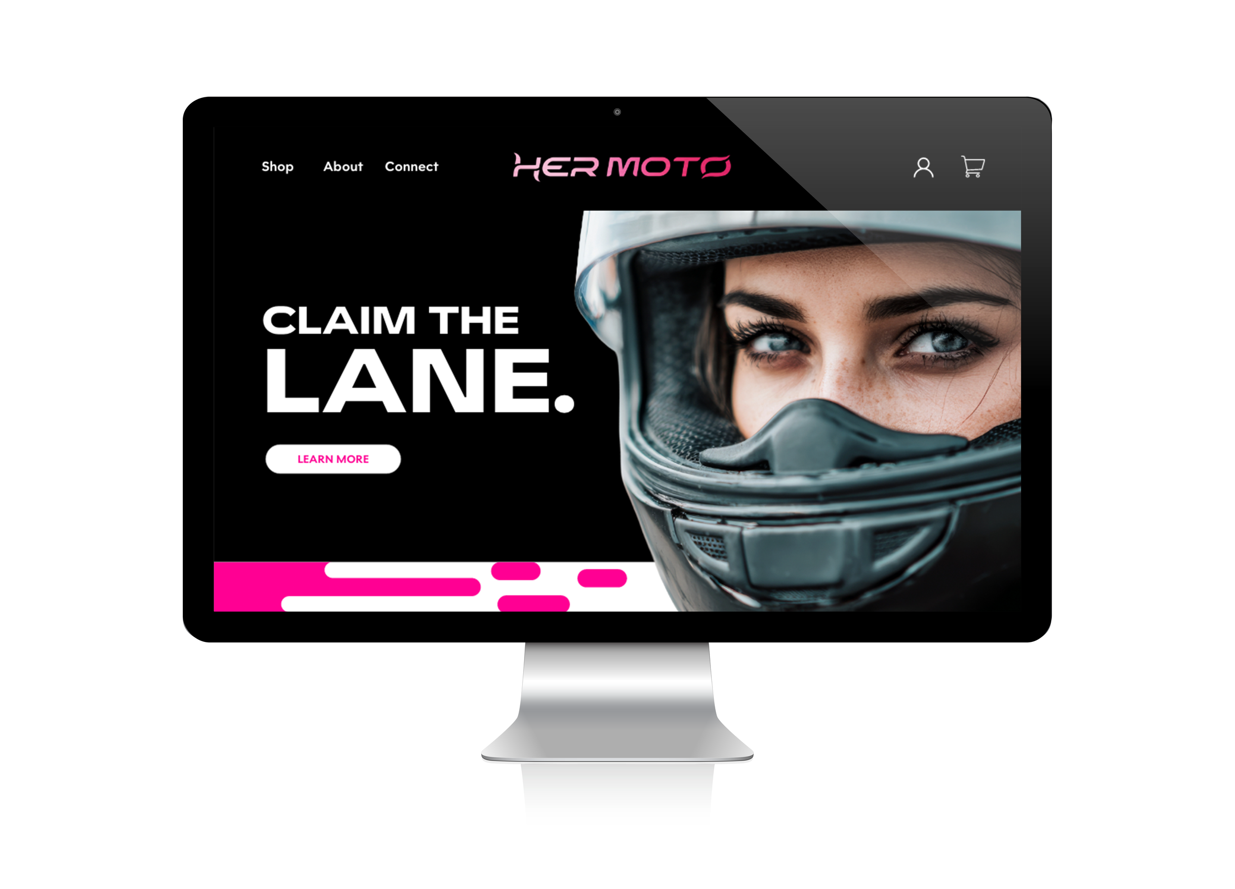
For my website process, I began with laying out everything I wanted to include on it. As this would not be the entire website but just a glimpse, I wanted to at least make sure I included a home, shop, about, connect, shopping cart, and checkout page. Having these components will give the viewer the chance to understand what HER MOTO is about. I designed this website according to the brand guidelines, sticking with Widescreen as the font and using the three major colors (pink, black, and white).
PROCESS WORK: POSTERS
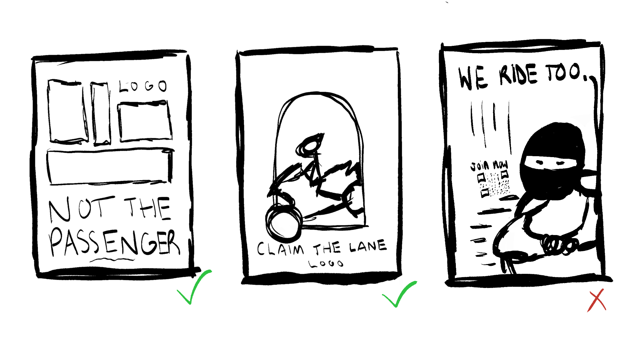
For my process of the posters, I sketched a few out first according to my brand taglines. I knew that I wanted to use promotional taglines and allow the hot pink to stand out on black background. I narrowed it down to using the “Not the Passenger” idea and the “Claim the Lane” one as well. These two worked well side by side, as they both promote women riders while giving off a sense of motion and fierceness. My third idea fell through, as it did not have the excitement like the other two did, losing how impactful the promotion would be.
BEGINNING
END
PROCESS WORK: STICKERS
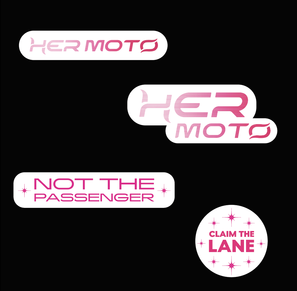
For my stickers, I researched other motorsport brands. Typically, they always create stickers of their logos, as it is easy to stick onto bikes for advertising. With that being said, I made sure to make one of my primary logo and one of my secondary logo. For the other two, I used the two taglines that I used for the posters, as they are short but have a big impact when seen quickly.